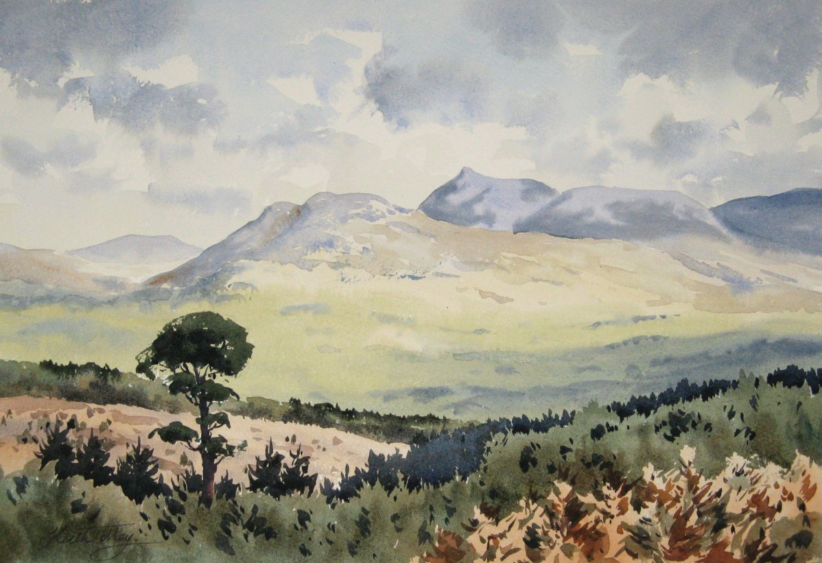
Venetian Red

For many years I have used the same palette of colours, mostly based on the Sienna and Umber earth pigments with a few primaries for mixing. However, recently I have been looking at new options to see whether I can make my paintings a bit brighter. One addition I have been considering is a red oxide. In the past I've used Light Red, but it didn't seem to offer much more than I could get with Burnt Sienna. In this painting I used Venetian Red and it seems more useful: it makes a nice muted pink, and a purple/grey with French Ultramarine. It was perfect for the red sandstone rock in this subject.


Good morning Keith!... Have missed your regular presence!
ReplyDeleteYour searching and infusing of new ideas certainly contributed to the goals that you were seeking. Following the plow instead of pulling certainly yields "fixed furrows" that are linear... and predictably like everyone else's.
But the most interesting furrows to me... are the ones that are curvilinear and because of sudden and unexpected shifts in planes from fore to background.
Those rich and accurate pinks create wonderful contrast to the purples and grays of the shadows in the foreground, This contrast is simply amplified... when ones eye drifts backward into the hazy and undefined land features in the distance.
A striking beautiful and wonderfully composed water color! Bravo!... Again!
Good Painting!
Warmest regards,
Bruce
Good evening Bruce. Yes, with various projects and commissions, blogging has been taking a back seat a bit recently. I'm quite excited by the potential of a new palette, and I'm glad you like the results of my experiments.
DeleteAll the best,
Keith
A beautiful painting, Keith. I like the way the 'pink' of the rocks picks up the pinkish colour of the sky in the background.
ReplyDeleteThanks Diane. Yes I was pleased with the way the colours worked together.
DeleteThat's a great painting Keith. As you know I've always been fascinated by, and a big fan of, your palette so I will follow any changes with much interest. I certainly like the way the Venetian Red worked in this one.
ReplyDeleteThanks John, I'll try to remember to post the results of my experiments.
Delete