Colour palette
On my last post Caroline asked about the colours and papers I use, so I thought I would take the opportunity to give a few details.
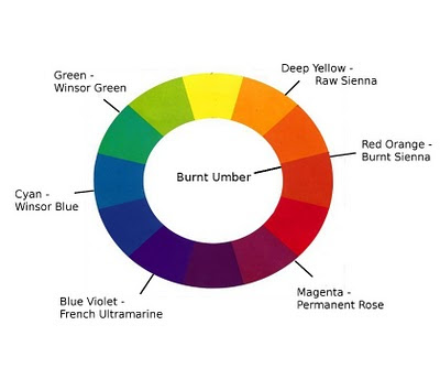
My usual palette consists of seven colours:-
Raw Sienna
Burnt Sienna
Permanent Rose
French Ultramarine
Winsor Blue (Green Shade)
Winsor Green (Yellow Shade)
Burnt Umber
Occasionally, for flowers or bright objects, I add Winsor Yellow and Scarlet Lake.
The colours are all transparent and are spread evenly around the colour wheel -
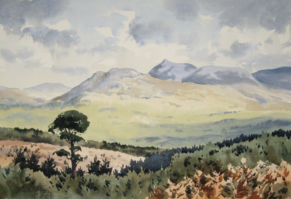
I find that this gives me the greatest number of possibilities for mixes. Most of the time I only have to mix two colours together. I can make a good range of warm greys with Ultramarine and Burnt Sienna, or cool greys with Winsor Green and Permanent Rose. Both mixes produce a very dark grey at full strength. In fact Winsor Green/Permanent Rose will give me as close to black as I ever need. I have Burnt Umber for dark mixes as well, but I tend to forget to use it because Burnt Sienna seems just as good for that purpose.
I don't always need to use all of the colours. In fact I have often only used Ultramarine, Burnt Sienna and Raw Sienna.
I used to follow the maxim that you should always mix greens from yellow and blue, and never use a ready-made green. However, I found that the mixes were often a bit opaque and nearly always involved using a bit of red to get the right colour. Since I started using Winsor Green (which is the pigment Pthalocyanine Green), I have found that I can get a good range of transparent greens by mixing it with the earth colours. Also I usually only need to use two colours.
The papers that I use at the moment are Bockingford Rough and Fabriano artistico in Rough and Not (Cold-pressed). I like these papers because they are not heavily sized and the paint flows on better. Sometimes I use other papers, like Arches or Saunders Waterford, but I find that they don't take the paint so well and it tends to dry lighter.
The paper is usually 300gsm (140lb) and unstretched. It does curl up a bit if I am doing a very wet painting, but it isn't usually too much of a problem. If it doesn't dry flat, I dampen the back and press it between sheets of clean paper overnight.


Hi Keith, thank you for this! it really does explain to me how you are able to achieve such freshness with your watercolours, by using the transparent pigments. You can also get some nice greys by mixing burnt umber and Ultramarine blue. Did you make a choice between whether you would use Ultramarine blue or French Ultramarine apparently there is a difference. I noticed it when I mixed each of them with other colours the other week. I also wonder about the use of permanent rose over rose madder? I love using rose madder though it is quite pricey to buy. What brand of watercolours do you use I have found a great difference in the W&N raw sienna to the Old Holland one, I actually find the W&N one to be better and more transparent. The old holland one is quite heavy almost muddy in pigment and closer to a raw umber. A fascinating subject!
ReplyDeleteFascinating post Keith. The paintbox I use is ages old and the colour information sheet that came with it long since lost, though I know a the names of a few of the colours. Usually I stick to the same few colours, but art school has expanded my thinking a bit of late, but I am still experimenting somewhat with opaque and transparent colours.
ReplyDeleteThanks for giving me some more food for thought.
Yes Caroline, Burnt Umber does make nice greys with Ultramarine. Maybe the Winsor and Newton version isn't the best for that though: I think other brands might be darker and cooler.
ReplyDeleteWinsor and Newton and Rowney used to have only one type of Ultramarine Blue, so I've never thought about it much; although I have been aware that there is a difference. W & N now have an Ultramarine (Green Shade), but I haven't tried it; I always use French Ultramarine.
I believe genuine Rose Madder fades in sunlight, so that's why I use Permanent Rose (the cost is a factor as well!) I haven't tried it for myself, but I did once test Alizarin Crimson and I was shocked by how much it faded in a few weeks. You could paint a strip, tape a piece of paper over half of it, and put it on a sunny window sill for a month or two. Then you can see for yourself whether it is OK for you.
I started with Daler Rowney paints, but I changed to W & N partly because of the same problem with Raw Sienna. Rowney use the natural earth, whereas W & N use a synthetic iron oxide (I think it should really be called 'Mars Yellow') which seems more transparent. The W & N paints seem to have more gum arabic in them, which makes them brighter and more transparent generally I feel.
I have found an amazing amount of information about pigments and paints on www.handprint.com.
I think it's well worth experimenting with colours Frank. Unfortunately the ones that come with paintboxes are often not the best selection.
ReplyDeleteDepending on your painting style, opaque colours can be useful. Some of the stronger ones, like the Cadmiums, can be diluted quite a bit and used transparently.
I am wondering if you are having the heavy snowfalls Keith in your area. We are really snowed under here. I had a look at the link about watercolours and must say it is very interesting to learn more about brands and pigments. I always felt that watercolour paintings must be kept away from bright light. In my aunt's home she always closed the curtains on a bright afternoon to protect her watercolour paintings. I didn't realise that rose madder and alizarin faded so quickly. I will look into trying some of the permanent rose in the future. Thanks again for the information.
ReplyDeleteHello Caroline,
ReplyDeleteYes we've had snow here, but not as much as you, I think. The roads are snowy but cars can still use them. It won't be disappearing quickly: temperatures will be around freezing for next week apparently.
I don't recommend hanging watercolours in sunlight, but modern pigments are much better than the old ones. Antique paintings are much more delicate. The old crimsons and magentas, like Carmine, Madder and Alizarin, were notorious for fading. Sap Green and Gamboge were other bad pigments (the modern colours are usually mixtures and are permanent).